Upwave
Making data feel human.

As an industry leading analytics company, they needed a revitalization of their brand identity.
Brand strategy
Social Media Templates
Pitch strategy
Website Prototype
Voice + Tone
Infographic Design
The BriefUpwave came to us looking for a visual and voice overhaul that translates complex analytics into clear, actionable insight that anyone can grasp.
THE ChallengeAnalytics brands often sound like robots overloaded with jargon and interfaces that require translators. Upwave’s product is smart and powerful, but they lacked approachability.
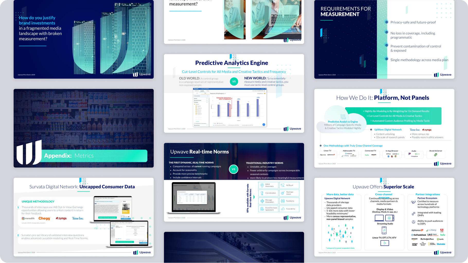

Our ApproachWe stripped away the noise and created a voice and branded templates that turned data into direction, rather than overwhelming numbers.
We refined their visuals to make the analytics interface feel clear and usable, so that complexity became insight at first glance.
No fluff. No overexplaining. Just clarity with authority.
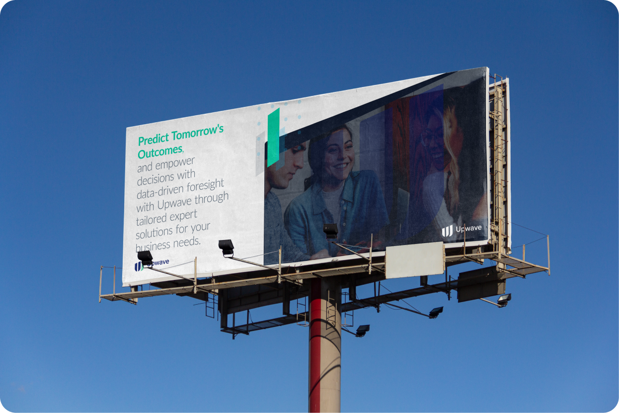

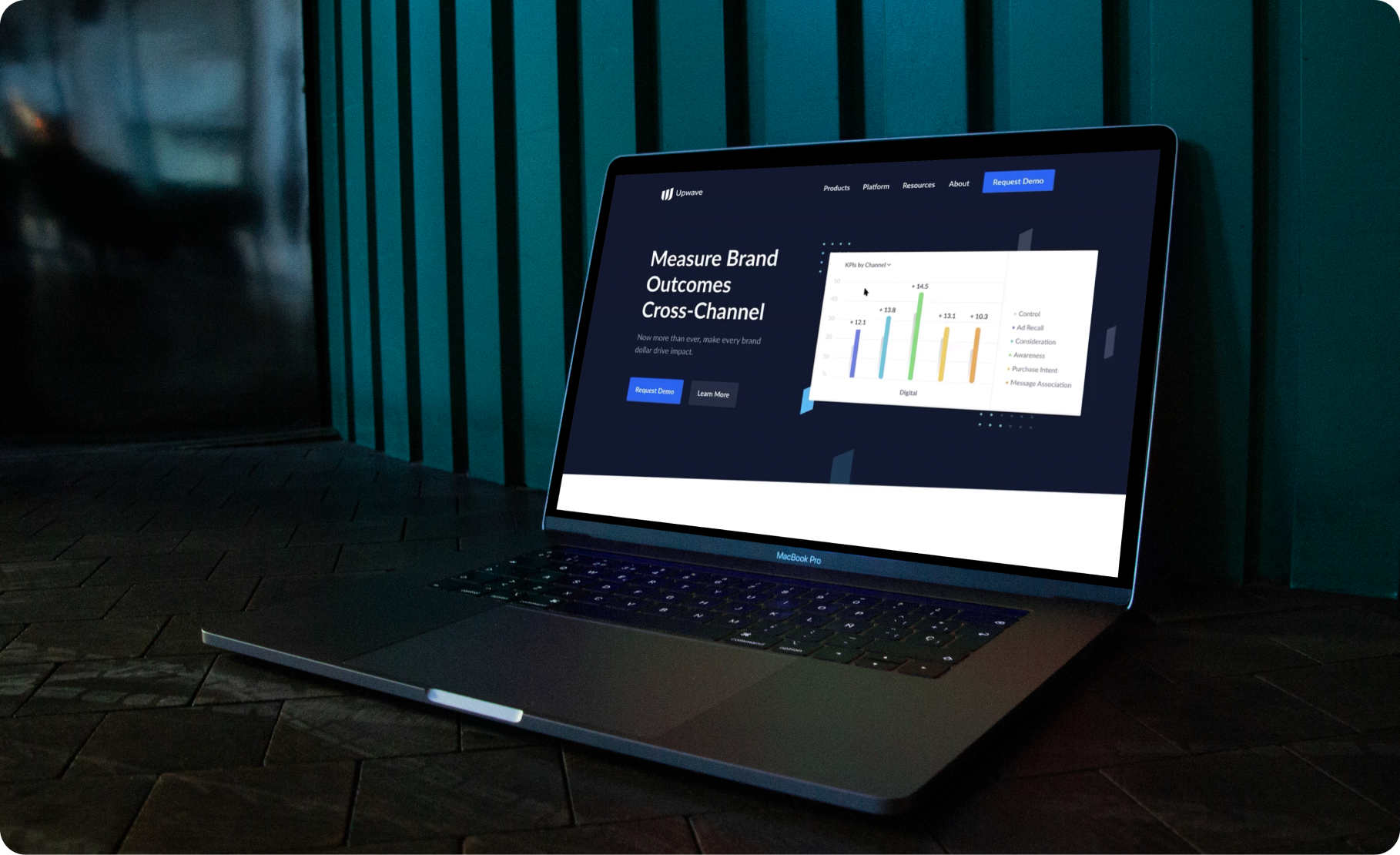
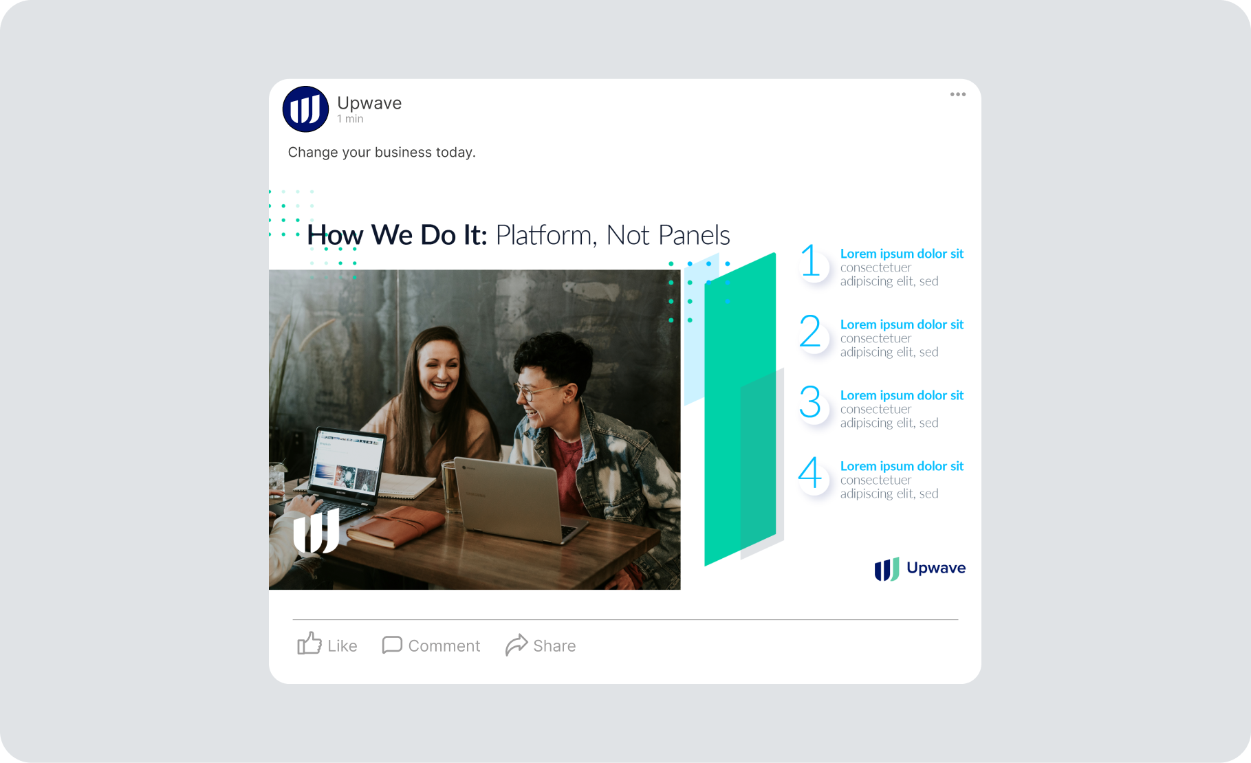

The RESULTUpwave looks and feels like the analytics partner brands actually want to use.
An approachable visual identity that guides the user through the platform
Messaging that turns complexity into clarity giving the user confidence in the product
“This overhaul helped make our product feel as powerful as it actually is. Our offerings are now clear, strategic, and relatable.”
– Upwave Leadership